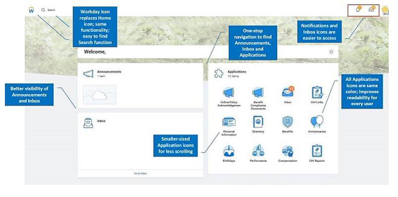
New Workday Homepage Features One-Stop Navigation
Hold onto your hat! Beginning July 2, you’ll see a new home page in Workday. The redesigned page will provide a one-stop navigation experience so you can easily find and access your HR tasks, announcements and inbox. For example, all application icons (“worklets”) will be the same color – rather than the current rainbow of colors – which will improve readability.
We use Workday to enroll in and view our benefits, complete performance evaluations and more. There’s a lot of important information behind the home page, and the new design will help you get to it more quickly.


